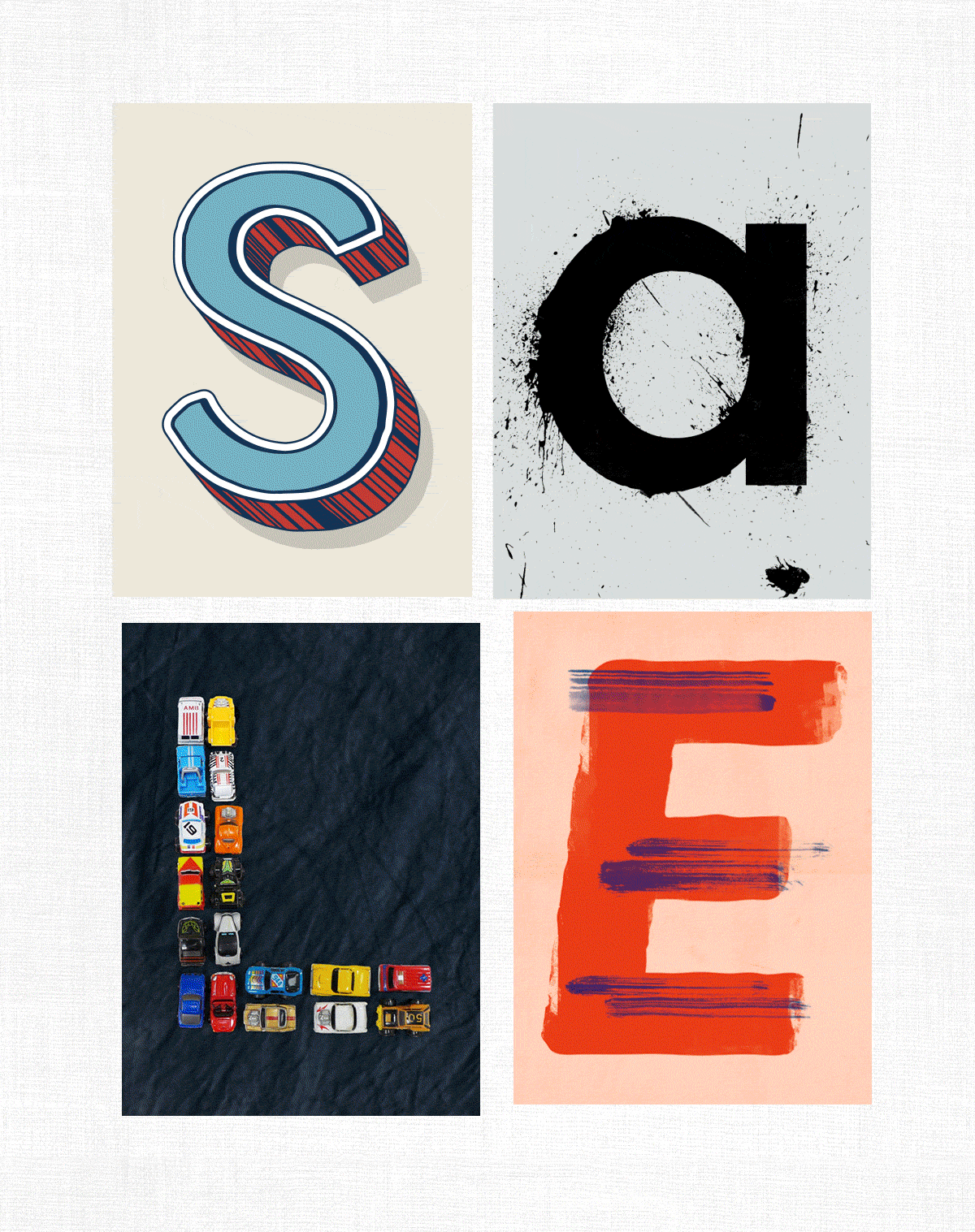
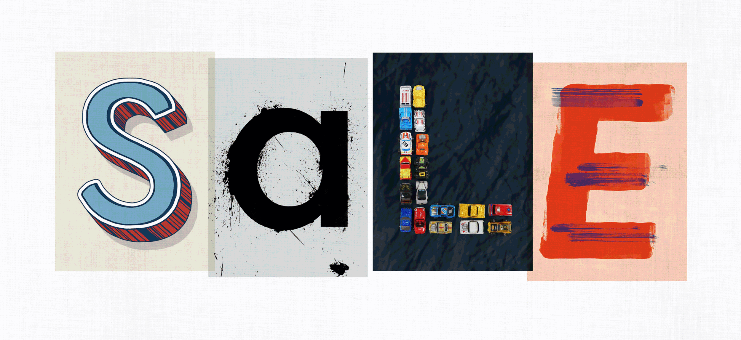


Objective
Explore a new ‘Sale’ look for FatFace. The colour red (synonymous with Sale) can be present but used more sparingly. Must be impactful.
Solution
Using strong unique typography, individual letterforms and a collaborative design process, the Sale refresh took on an identity, organically driven by individual contribution and personality.
Result
The unique result had impact for all FatFace customer channels. Sales figures suggested we had a record year.